Unusual Alternatives to Pie Charts
Before you cook up another pie, consider these alternatives
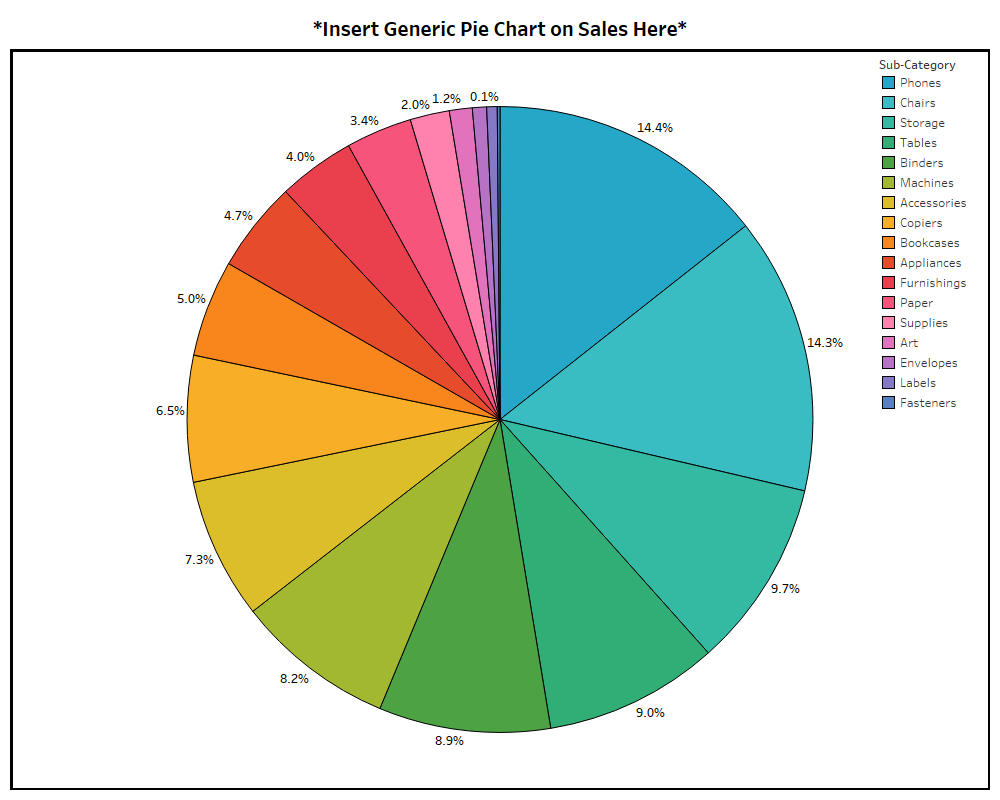
Every time I see a 3D pie chart made in Excel, I die a little on the inside.
When working in data visualization, you hear all sorts of opinions on pie charts.
Some people feel they should never be used.
Mathematician John Tukey felt there was no pie-chart data that couldn’t be better displayed in any other type of chart.
Other people really like them.
 Unlike Tukey and design theorist Edward Tufte—who said, “The only worse design than a pie chart is several of them”—I am not of the opinion that pie charts should never be used.
I just think they should be used less often.
I have sensed similar feelings toward Excel spreadsheets.
They have even earned the nickname “walls of data.” The connection here is that pie charts and Excel spreadsheets are both overused and stretched to do things they were not meant to do.
However, just like you wouldn’t remove colors from the painter’s palette and say, “No more green for you!” I don’t think the solution is to delete Excel and pie charts off everyone’s computer.
Perhaps it’s more about making sure the painter has more colors to pick from.
Most existing content on this subject of pie-chart dislike will just direct you to a bar chart or line chart instead.
But I have challenged myself to show you five unusual alternatives to boring data visualization.
Here they are, ending on the one I like most:
Unlike Tukey and design theorist Edward Tufte—who said, “The only worse design than a pie chart is several of them”—I am not of the opinion that pie charts should never be used.
I just think they should be used less often.
I have sensed similar feelings toward Excel spreadsheets.
They have even earned the nickname “walls of data.” The connection here is that pie charts and Excel spreadsheets are both overused and stretched to do things they were not meant to do.
However, just like you wouldn’t remove colors from the painter’s palette and say, “No more green for you!” I don’t think the solution is to delete Excel and pie charts off everyone’s computer.
Perhaps it’s more about making sure the painter has more colors to pick from.
Most existing content on this subject of pie-chart dislike will just direct you to a bar chart or line chart instead.
But I have challenged myself to show you five unusual alternatives to boring data visualization.
Here they are, ending on the one I like most:
5.
The Dumbbell Chart
One of the most common abuses of pie charts is to use many of them together to display change over time or across categories.
If the primary message you want to send to your viewer is variance, it’s helpful to know that humans are really good at detecting and valuing the distance between objects.
The dumbbell chart, also known as the DNA chart, is a great way to show change by using visual lengths.
Technically this chart is a tri-bell rather than a dumbbell, but the point is that it gives the information some dimension.
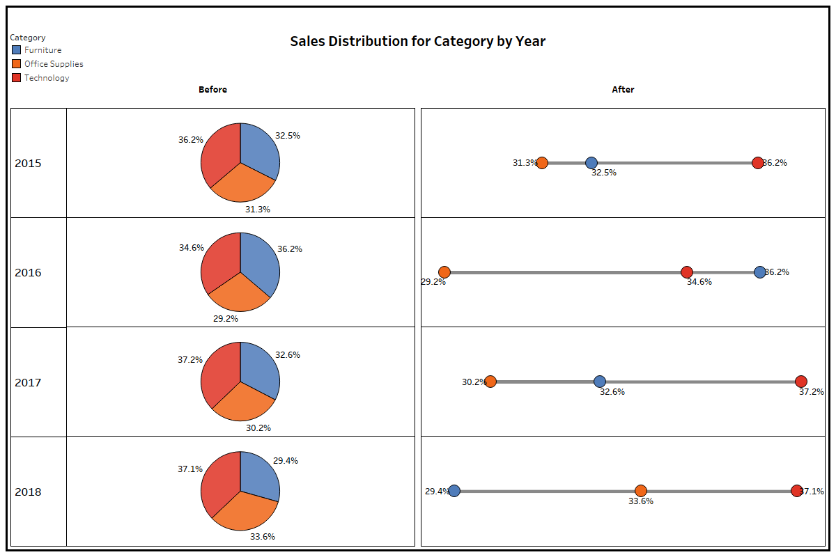 Visualization: Shelby Temple, made with Tableau; data: Tableau Sample Superstore
From a visual perspective with the dumbbell/tri-bell presentation, it is easy to see that in 2018, furniture had a lower sales distribution than office supplies and technology.
By contrast, the pies all look like peace signs, and it is really hard to know both the rank across the categories and how they have changed year over year.
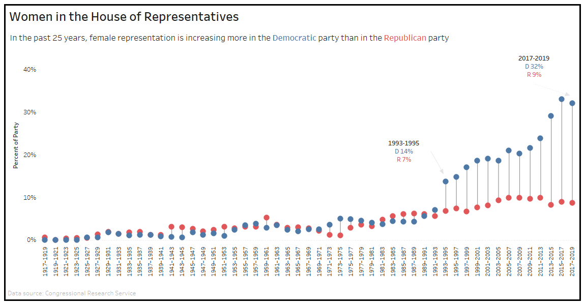
Here’s a great dumbbell chart example that reflects the increase of women in the House of Representatives as it relates to party:
Visualization: Shelby Temple, made with Tableau; data: Tableau Sample Superstore
From a visual perspective with the dumbbell/tri-bell presentation, it is easy to see that in 2018, furniture had a lower sales distribution than office supplies and technology.
By contrast, the pies all look like peace signs, and it is really hard to know both the rank across the categories and how they have changed year over year.
Here’s a great dumbbell chart example that reflects the increase of women in the House of Representatives as it relates to party:
4.
The Bump Chart
Variance may not be important to you.
Maybe you want to show a ranking among the categories over time.
Then I would point you to a special version of a line chart called the bump chart.
Here’s the same information as in the previous example expressed a bit differently:
 The greatest pro for the bump chart is that it’s really effective at visualizing ranks.
But, for the cons, they can get noisy if ranks change a lot or if you have many categories.
And like with the dumbbell chart, viewers likely won’t realize you are comparing parts with the whole.
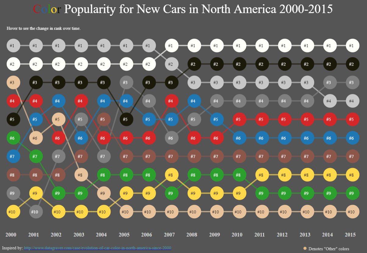
Here’s an effective bump chart example that displays the popularity ranks of new car colors and how they’ve changed over 16 years:
The greatest pro for the bump chart is that it’s really effective at visualizing ranks.
But, for the cons, they can get noisy if ranks change a lot or if you have many categories.
And like with the dumbbell chart, viewers likely won’t realize you are comparing parts with the whole.
Here’s an effective bump chart example that displays the popularity ranks of new car colors and how they’ve changed over 16 years:
3.
The Donut
The first two suggestions are certainly different approaches to variance and ranking, but sometimes you need a simple way to convey the parts with the whole.
It may be important for a viewer to quickly know that something adds up to 100 percent.
And maybe you just like the shape of circles because they symbolize many good things, like the sun or wheels—or donuts.
Check out how even though it’s the same shape as a pie chart, the donut conveys information a bit differently:
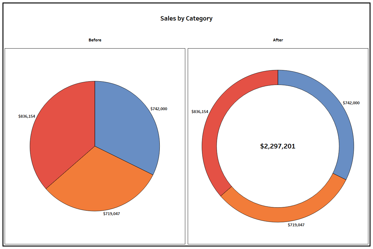 Because people are so overexposed to pie charts early and often throughout their lifetimes, there’s a key advantage in translating the info to a donut—it speeds up the time it takes the viewer to decode the parts and the whole of the visualization.
(On a side note, do you ever wonder if there is a correlation between people who like donut charts and stuffed-crust pizza? I do.
Please send me that data set.)
The pros of a donut chart are that it’s effective at showing parts within a whole, but unlike a pie chart, it frees up white space at the core to throw in a total, call out a number, or add another data marker.
It can also be used as a gauge to call out a single percentage.
The cons are that it’s hard to interpret things like variance and rank, and humans generally aren’t as good at registering the differences in the ring’s filled-in angle area as with other easy-comparison formats like bar charts.
It can be done, though.
Here’s an example of a donut that is effective at using the ring’s shading to display salaries in proportion to each other:
Because people are so overexposed to pie charts early and often throughout their lifetimes, there’s a key advantage in translating the info to a donut—it speeds up the time it takes the viewer to decode the parts and the whole of the visualization.
(On a side note, do you ever wonder if there is a correlation between people who like donut charts and stuffed-crust pizza? I do.
Please send me that data set.)
The pros of a donut chart are that it’s effective at showing parts within a whole, but unlike a pie chart, it frees up white space at the core to throw in a total, call out a number, or add another data marker.
It can also be used as a gauge to call out a single percentage.
The cons are that it’s hard to interpret things like variance and rank, and humans generally aren’t as good at registering the differences in the ring’s filled-in angle area as with other easy-comparison formats like bar charts.
It can be done, though.
Here’s an example of a donut that is effective at using the ring’s shading to display salaries in proportion to each other:

2.
The Treemap
A primary argument against the pie chart is that humans are not good at detecting differences between angle sizes.
Treemaps alleviate this by using area instead of angles to designate proportion.
Using the same data as in the donut format above, this version uses sized rectangles:
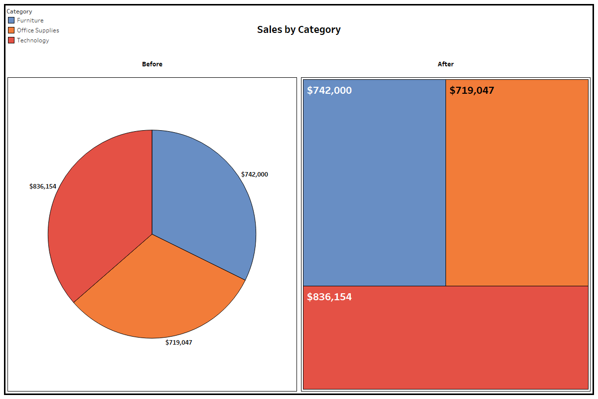 In addition to the pro of displaying data with area space rather than angles, treemaps are more useful than pie charts when there are more than five categories (avoiding the sometimes hard-to-label pie slivers) and in visualizing subcategories within categories.
The main con is that people are much less familiar with this format.
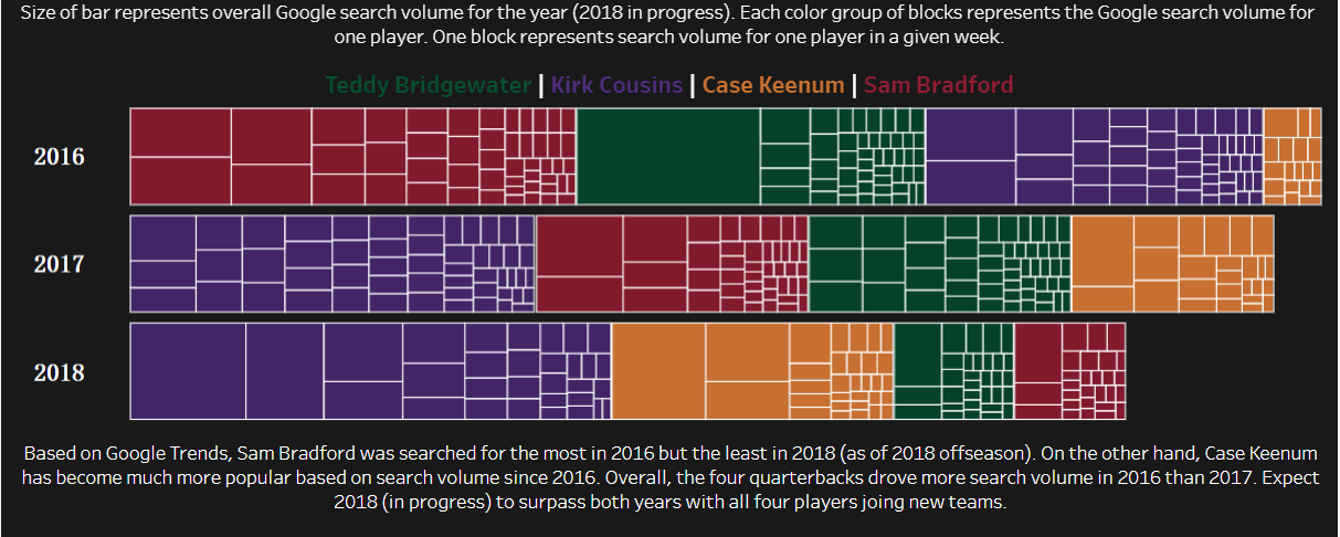
Here’s another treemap example that aims to show a lot of comparative information in its visualization of the weekly volume of Google searches of four football players across years:
In addition to the pro of displaying data with area space rather than angles, treemaps are more useful than pie charts when there are more than five categories (avoiding the sometimes hard-to-label pie slivers) and in visualizing subcategories within categories.
The main con is that people are much less familiar with this format.
Here’s another treemap example that aims to show a lot of comparative information in its visualization of the weekly volume of Google searches of four football players across years:
1.
The Waffle Chart
The waffle chart is a really fun chart and probably my favorite alternative to pie charts—and not just because it’s also named after food.
Because it’s typically made with 100 squares representing the whole, it can be shaded or filled based on the relation of several parts to a whole, just like a pie chart, but it’s also good for displaying a single percentage.
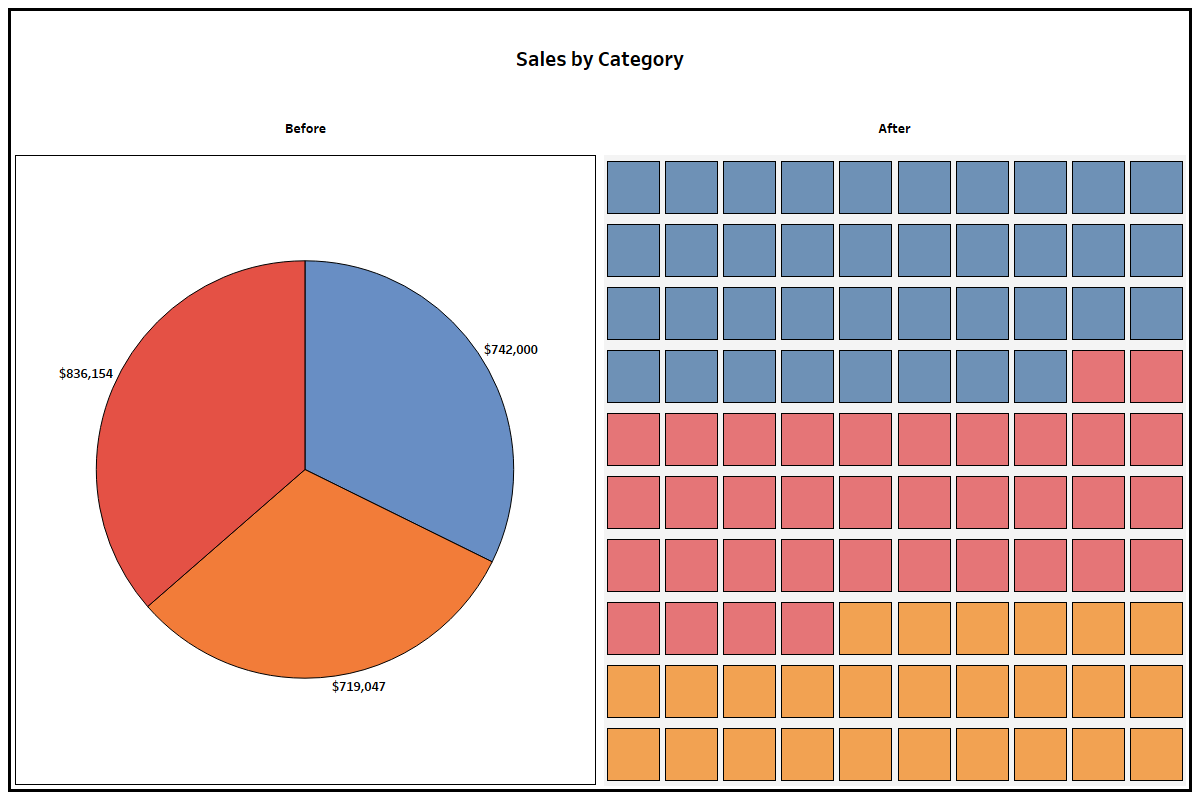 The key pro is its diversity in being able to show individual parts of a whole and compare single percentages, but another advantage—similar to treemaps—is that proportions are more clearly represented by area instead of angles.
The cons are that it becomes too complicated when too many segments are involved, and the individualized spaces don’t leave a good spot to put numbers or much text within the visual itself.
Here’s another waffle chart example that neatly displays comparative survival rates for types of cancers:
The key pro is its diversity in being able to show individual parts of a whole and compare single percentages, but another advantage—similar to treemaps—is that proportions are more clearly represented by area instead of angles.
The cons are that it becomes too complicated when too many segments are involved, and the individualized spaces don’t leave a good spot to put numbers or much text within the visual itself.
Here’s another waffle chart example that neatly displays comparative survival rates for types of cancers:
 These are only a handful of diverse and creative ways you can visualize data.
I also considered other unusual diagram alternatives: Marimekko charts, Sankey flow diagrams, radial pie charts, and sunburst charts.
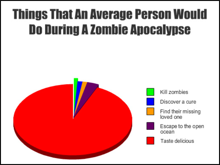
Let me just leave you with one last 3D pie chart:
These are only a handful of diverse and creative ways you can visualize data.
I also considered other unusual diagram alternatives: Marimekko charts, Sankey flow diagrams, radial pie charts, and sunburst charts.
Let me just leave you with one last 3D pie chart:
Data Storytelling Tips for Creating More Persuasive Charts and Graphs
Working with numbers isn’t usually thought of as a sexy job.
After all, occupations like accounting and data entry aren’t exactly the most exciting vocations in this digital era.
But just like the once-unglamorous computer geek now rules the world, data analysts are currently perceived as
“unicorns of the job market.”
The ability to make sense of large volumes of messy data and find unique insights in them is one of the
hottest skills in the job market, according to LinkedIn.
And it’s easy to see why:
More data has been created since 2013 than in all of human history before that date.
As a result, there’s not only a high demand for data scientists but also those who know how to visualize and present data in an effective and persuasive manner.
This is where
data storytelling comes into the picture.
A combination of
data, visuals and narrative, data storytelling is the hot, new data science skill
everyone will need in the future.
 For those who are uncomfortable with numbers, this may be really bad news.
But before you start panicking, let’s start with some simple facts that will help you understand how our brains process visuals and how you can use these principles to improve your charts and graphs.
For those who are uncomfortable with numbers, this may be really bad news.
But before you start panicking, let’s start with some simple facts that will help you understand how our brains process visuals and how you can use these principles to improve your charts and graphs.
The Visual Brain and How it Works

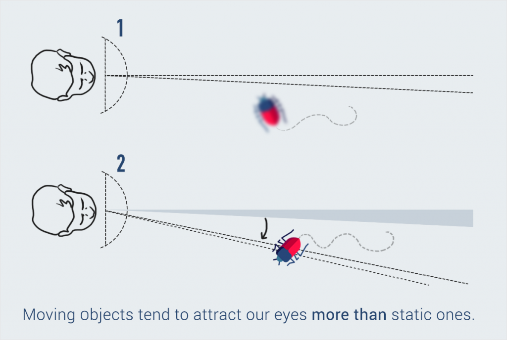
 Contrary to what you may have learned in high school, human vision is much more complex than just processing the light that is reflected by an object.
Although we can apparently see everything within a 180-degree angle, we can actually only view with full accuracy those things that are in the very center of our field of vision, within a very narrow field of two degrees.
How is it then that we don’t see a blurry mass of things?
Thanks to rapid ocular movements called
saccades, we are able to perceive the objects that lie in the remaining 178-degree angle.
Without noticing it, our eyes jerk rapidly and fixate on different points of a scene to create an accurate visual map from this aggregate information.
Although these movements are unconscious, our eyes prioritize what they fixate on.
For example, bright colors, uncommon shapes and moving objects immediately draw our attention, even if they are not right in front of us.
(Source:
The Functional Art by Alberto Cairo)
Contrary to what you may have learned in high school, human vision is much more complex than just processing the light that is reflected by an object.
Although we can apparently see everything within a 180-degree angle, we can actually only view with full accuracy those things that are in the very center of our field of vision, within a very narrow field of two degrees.
How is it then that we don’t see a blurry mass of things?
Thanks to rapid ocular movements called
saccades, we are able to perceive the objects that lie in the remaining 178-degree angle.
Without noticing it, our eyes jerk rapidly and fixate on different points of a scene to create an accurate visual map from this aggregate information.
Although these movements are unconscious, our eyes prioritize what they fixate on.
For example, bright colors, uncommon shapes and moving objects immediately draw our attention, even if they are not right in front of us.
(Source:
The Functional Art by Alberto Cairo)
 Information source:
The Functional Art
Once light has been encoded into electrical signals, the brain then extracts the main features, beginning with a gross shape and patches of color, and only then starts to really process and identify what is in front of the person, using a lot of information from long-term memory.
To get a more visual explanation, you can also
watch Payman Taei describe the science behind how we perceive objects here:
Information source:
The Functional Art
Once light has been encoded into electrical signals, the brain then extracts the main features, beginning with a gross shape and patches of color, and only then starts to really process and identify what is in front of the person, using a lot of information from long-term memory.
To get a more visual explanation, you can also
watch Payman Taei describe the science behind how we perceive objects here:
Our Visual Brains Are Attracted by Difference
So, instead of capturing an entire scene like a camera, our eyes actually focus first on key points that stand out.
That’s why our visual brains immediately notice difference and contrast.
Just take a look at the image below.
How long did it take you to see the bear in the first two illustrations? And the last one?
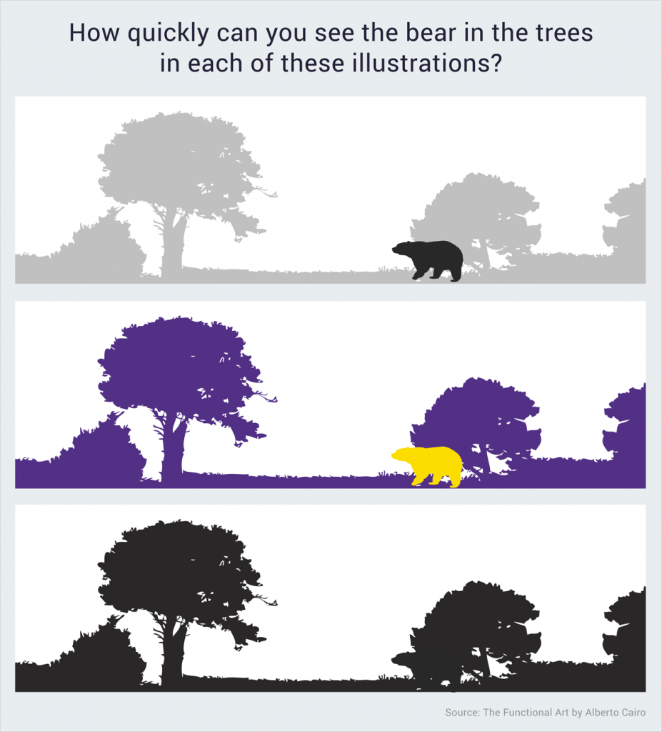 This simple exercise reveals that our brains are much better at identifying differences in color rather than shapes.
Our Brains Are Designed to Identify Patterns
Did you know that your senses are constantly processing all kinds of information from the environment before you’re even consciously aware of it?
This is called pre-attentive processing and without it, we would waste a whole lot of time trying to make sense of the world around us.
Thankfully, our visual brains make things easy for us by automatically detecting differences and similarities between objects.
For example, take a look at this image below.

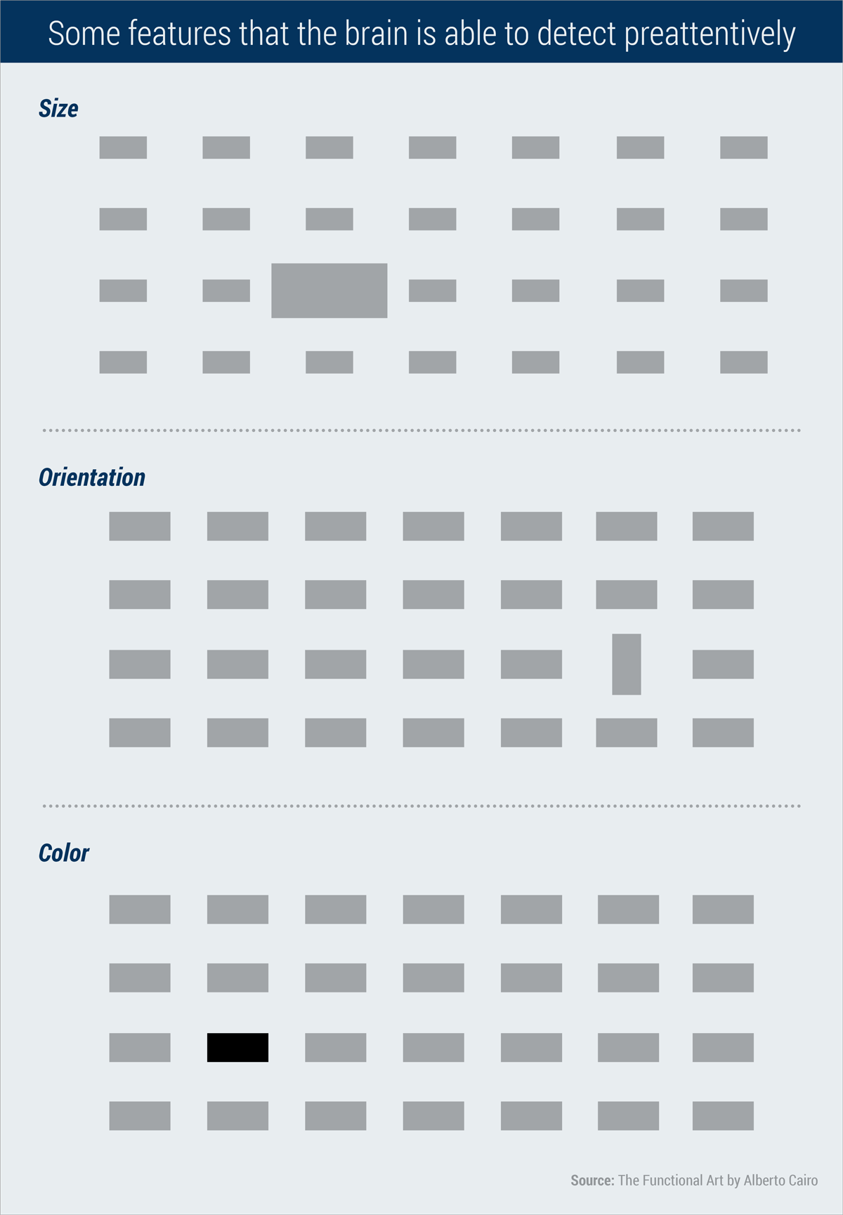 Did you immediately focus on the one large rectangle in the middle? In the second section, you probably noticed right away how one rectangle has a vertical orientation, unlike the rest.
This is the visual brain for you: It is designed to notice patterns and immediately detect disruptions of those patterns.
Did you immediately focus on the one large rectangle in the middle? In the second section, you probably noticed right away how one rectangle has a vertical orientation, unlike the rest.
This is the visual brain for you: It is designed to notice patterns and immediately detect disruptions of those patterns.
5 Data Storytelling Tips for the Visual Brain
Now that we’ve had a peek at the science behind the way we perceive objects, let’s look at how this knowledge translates into practical tips for creating effective and persuasive data visualizations, from the guide
Good Charts by Harvard Business Review.
1.
Our eyes don’t follow a specific order.
Creating effective data visualizations requires learning a new language with new grammar rules.
The first difference between reading a page with text and reading a chart or graph is that with the first, you read in order: from left to right, from top to bottom, in Western culture.
With the second, there is no predetermined order–you simply go where your eyes take you.
 The pace is also different.
Instead of steadily reading line by line, you jump from one thing to the next and spend longer amounts of time on some parts than others.
This means that it’s especially challenging to create effective visualizations that deliberately take viewers on a predefined visual journey.
The pace is also different.
Instead of steadily reading line by line, you jump from one thing to the next and spend longer amounts of time on some parts than others.
This means that it’s especially challenging to create effective visualizations that deliberately take viewers on a predefined visual journey.
2.
Our eyes first focus on what stands out.
When we look at a chart or graph, like the one below, we don’t see everything at once but instead focus on one salient point.
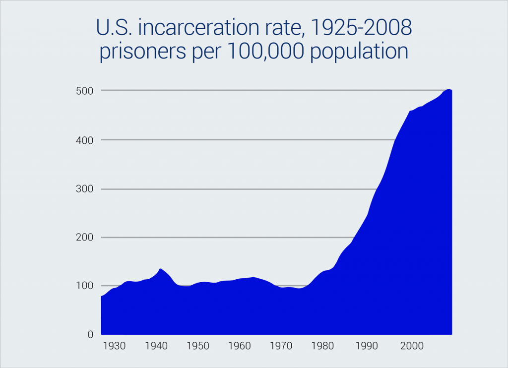 The first thing that stands out in this graph is the peak at the far right.
The central message of this visual is crystal clear: the U.S.
incarceration rate has increased exponentially since the 1970s.
The best data storytellers take advantage of this principle by creating charts and graphs with one clear message that can be effortlessly understood.
The first thing that stands out in this graph is the peak at the far right.
The central message of this visual is crystal clear: the U.S.
incarceration rate has increased exponentially since the 1970s.
The best data storytellers take advantage of this principle by creating charts and graphs with one clear message that can be effortlessly understood.
3.
Our eyes can handle a few things at once.
Whenever you have a graph or chart with more than 5 to 10 variables, the individual units start to lose their individuality and are perceived by our eyes as a single whole.
With this in mind, you should
simplify your charts so that they highlight one main point you want to make.
Take, for example, this chart.
The first things you notice are the peak in the middle, the green line and the word “outage.”
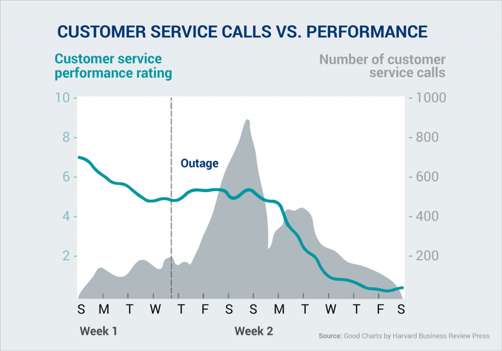 If the objective is to convey a clear message through a declarative chart (rather than an exploratory one), then you’ll see that there’s no clear message here.
Let’s say, for example, that you want to reveal that performance ratings continued to decline even after the outage, then the viewer has to work hard to find this trend, as the peak in the background distracts from the green line.
The best solution, in this case, is to eliminate the number of customer service calls data and focus on customer service ratings before and after the outage.
If the objective is to convey a clear message through a declarative chart (rather than an exploratory one), then you’ll see that there’s no clear message here.
Let’s say, for example, that you want to reveal that performance ratings continued to decline even after the outage, then the viewer has to work hard to find this trend, as the peak in the background distracts from the green line.
The best solution, in this case, is to eliminate the number of customer service calls data and focus on customer service ratings before and after the outage.
4.
We try to find meaning in the data.
Another important fact is that our brains are designed to immediately look for connections and try to find meaning in the data.
If you look at this chart, you’ll find that your brain unconsciously makes the connection between the orange in the title and the orange-colored dots.
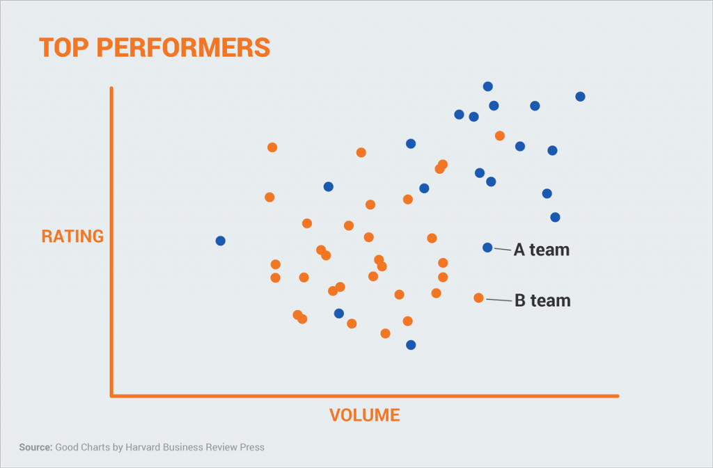 “This must mean that the orange dots represent the top performers,” our visual brain concludes.
Wrong.
Actually, the top performers are those plotted to the top right of the chart and have nothing to do with the selection of colors.
Knowing this, we must make smart design decisions and
assign colors deliberately to improve the functionality of your visual.
“This must mean that the orange dots represent the top performers,” our visual brain concludes.
Wrong.
Actually, the top performers are those plotted to the top right of the chart and have nothing to do with the selection of colors.
Knowing this, we must make smart design decisions and
assign colors deliberately to improve the functionality of your visual.
5.
We are guided by cultural conventions.
There are certain conventions that we take for granted.
For example, in Western culture, we all intuitively know that when visualizing time, it moves from left to right, not right to left; or that blue means cold and red means hot.
The same goes for visual metaphors: We all associate a pyramid with hierarchy or a scale with a comparison of two things.
If you ignore these conventions, then it goes without saying that your visuals will be hard to decipher.
Just take a look at this chart and how hard it is to extract meaning from it when time is placed on the Y-axis rather than the X.

Examples of How to Improve Data Storytelling
Here are some examples of how to improve charts and graphs so that they don’t simply display data
but tell a story, from the book
Storytelling with Data by Cole Nussbaumer Knaflic.
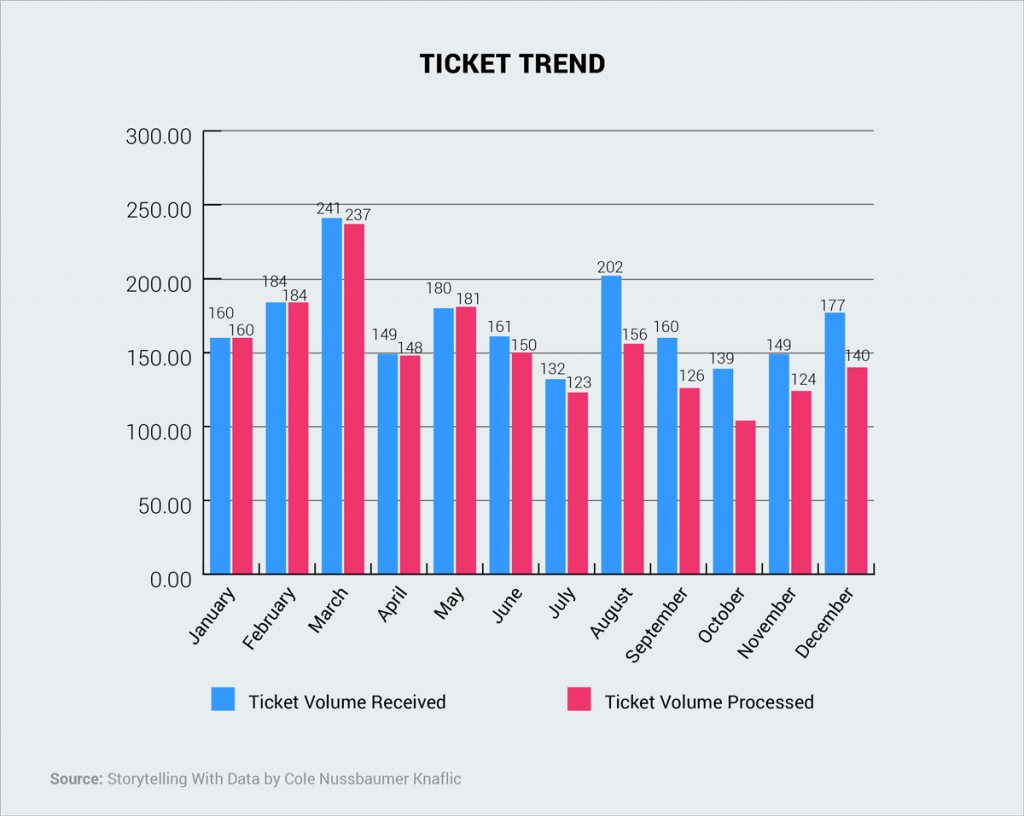
Before
This bar chart displays the number of tickets received and processed in a year.
After
If your purpose is to convey a message and move someone to a specific action (in this case, the hire of two new employees), then this is much better.
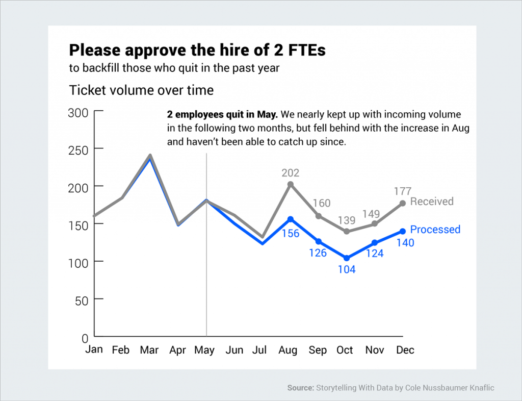 By choosing a line graph over a bar chart, the growing difference between the amount of tickets received and those processed is made completely apparent.
Before
This is another example of data displayed without a narrative or clear message.
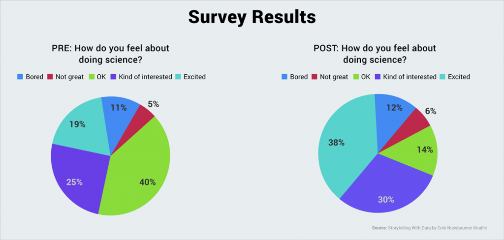
After
Now look at this same data set presented in a completely different manner.
Big difference, right? The central message is immediately clear: More children were excited about science after the program.
 The use of single chart rather than two separate ones allows viewers to quickly understand the results of the survey.
Also, the use of a few colors, not five or six, and an effective title helps the reader to quickly grasp the differences between pre- and post-program results.
The use of single chart rather than two separate ones allows viewers to quickly understand the results of the survey.
Also, the use of a few colors, not five or six, and an effective title helps the reader to quickly grasp the differences between pre- and post-program results.
Before
Another example of an ineffective chart that is accurate but does not communicate or persuade an audience to take a specific action.

After
In this chart, our eyes are immediately drawn to the blue strip, the gray lines and the blue dot representing the average price point.
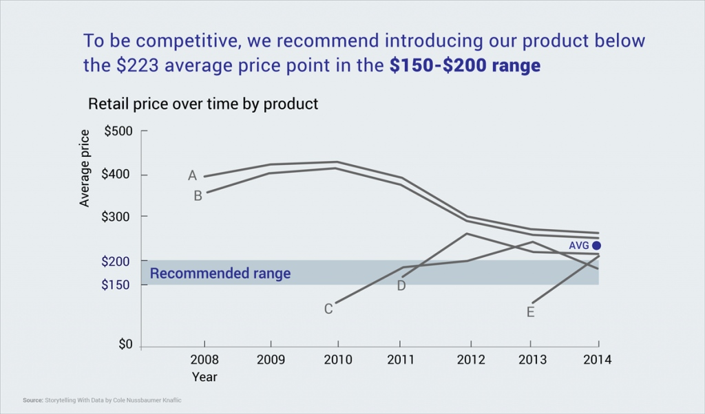 The central message is immediately clear: To be competitive, the ideal price is within the $150 to $200 range.
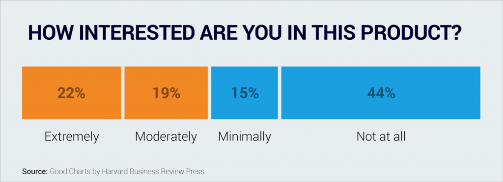
Before
At first glance, this pie chart seems clear enough, but upon deeper analysis, you’ll find that it doesn’t abide by several conventions that allow viewers to quickly grasp the information.
 Normally, we would expect values on an artificial scale to be arranged in order, from “not at all interested” to “extremely interested.” But in this case, the values are arranged in accordance with the percentages of each response.
We would also expect the changes in color to correspond to the artificial scale, with one color on one end of the scale and the second on the opposite end, and intermediate tones in between.
Normally, we would expect values on an artificial scale to be arranged in order, from “not at all interested” to “extremely interested.” But in this case, the values are arranged in accordance with the percentages of each response.
We would also expect the changes in color to correspond to the artificial scale, with one color on one end of the scale and the second on the opposite end, and intermediate tones in between.
After
This is much easier to decipher at first glance.
Arranged according to the values on a scale, we quickly understand that a majority of people are not interested in this particular product.
Your Turn
Now that you’ve learned a few simple principles for more persuasive and effective data storytelling, you can try your hand at creating your own visual data stories with this
free chart and infographic tool.
And if you have any data storytelling tips of your own you’d like to share, please drop us a line below in the comments section!